TicketSignup's Website Builder enables your organization to add custom content sections with images, video, playlists, call-to-action buttons, formatted text, and more to feature additional information about your event and organization on your event’s website. Ticket event websites are easy to create and even easier to manage with the Website Builder.
Accessing the Website Builder
After setting up your Ticket Event, you will have access to the Website Builder in your Event Dashboard. Go to Website >> Website Builder, or type “Website Builder” in the menu search.

The Website Builder gives you an intuitive and easy interface to add custom sections that feature your content. You will see some default sections that are automatically generated for your website based on information that you completed in the Ticket Wizard.
System Pages
When your event is created the Info page will be you home page by default. In addition, your website will have the Buy Tickets, Donate (if donations are enabled), and Store (if you have added store item(s)) tabs. These are system pages that will take you directly into the purchase path, donation page, or standalone store (if available), respectively. You can edit, hide, or delete these pages in the website builder.

Theme Options
The Theme Options drop down in the top right corner of the website builder, gives you the ability to redirect the page to make additional adjustments to the event theme settings (which can also be found under Website >> Event Theme). You can choose to make edits to the Homepage Banner, Page Banner (used on all pages, except the home page and system pages), Logo, and Color Scheme:

For more information on these settings, read our Event Theme help guide here.
See below for additional information on using the website builder.
Adding Pages to Your Website
To add a new page to your website, click the + button in the Navigation on the right hand side of the website builder:

You can select Add New Page to add custom content, Add System Page to select from our system generated pages, Add New External Link to direct people to another website when they click that menu tab or Add New Drop Down to add a new dropdown tab that collapses multiple pages.
To add a new content section to a page on your website click Add New Section at the bottom of the Website Builder to make it easy to add more content as you are building your website.

There are two options when you add a section: Single Column or Two Column. When you create a new section, add a title in the top text box.
The settings icon allows you to customize section settings. You have the option to customize the background color by clicking the settings icon in the top right corner of the column.
Note: The color choices available are linked to your Ticket Event’s theme colors that are set in the dashboard.

The trashcan icon allows you to delete a section.
Click the + sign on any section to start adding your content using the Website Builder components.
Website Builder Components
Once you have added a page in the Website Builder, you can click the +Add Section button at the bottom of the page to add various sections to the page. Then, you can click the + button within each section to add a Website Builder component within that section:

Note: You can click Save at the top-left of the page at anytime to save your custom sections.
Contact Form
You can add a contact form to allow supporters to send a message to the Contact Email input in the first step of the Ticket Wizard, which can also be changed under Event >> Basic Info in the Event Dashboard. Note: This form will automatically display on the Info page when the event is created, but it can be removed and added to different pages.
The Contact Form will display when the Questions? button is clicked for supporters to enter their name, email, phone number (optional), and message:

Text
When you add custom text, an editor will appear to give you flexible formatting options, including headers, text style, and text alignment.

Button
You can add call-to-action buttons throughout your content sections. Buttons can redirect to common actions on the ticket website, like ticket purchase or the donation page. They can also be used for any custom URL. For example, you may want to link attendees back to your nonprofit’s main website.
After adding a button to any section, click Edit Me to customize the button. The preview of the button will update in real time as you add button text and choose a color.

Image
When you add an image, you will have an easy upload option that allows you to drag and drop or search for an image to add. Once you’ve added an image, there is an Image Options dropdown that gives you formatting options to customize the alignment and size.

You can also choose an image from our Image Gallery that offers a number of images in each of the following categories:
- Halloween
- Biking
- Golf
- Holiday Lights
- Harvest
- Run/Walk
- Haunts
- Triathlon
To pull an image from the gallery, click the Image Gallery Tab and select the desired category from the dropdown menu:

To add an image to an existing text block, click the image icon in the upper right corner. You will have the same flexible alignment and sizing options when adding an image to a text block.

Image, Text, Button
The Image, Text, Button component will create a section with and image, text and button in order from top to bottom:

You can rearrange these sections using the up and down arrows in the top right of each section and edit each of the items the same way you would the individual Image, Text or Call-to-Action Button components
YouTube Video
To add a YouTube video to a custom section, paste the video ID in the text box.

The website builder will use the cover image from the YouTube video. When a supporter clicks to view the video, it displays nicely on the website with a pop-out viewer to play the video, and the supporter can easily return to the website when done. This is an easy way to include video content without redirecting your website visitors to a different URL.

Playlists
You can also feature playlists from Spotify, YouTube or Apple Music. This is a fun way to add more interactive content to your website, especially for virtual and hybrid events. When you paste the link to a playlist, there is a nice display formatting that shows the playlist directly on your website.

Slideshow
You can create photo slideshows (of up to 10 images) to feature event photos to further customize your website and promote ticket purchases! For more information on this component, view our Photo Slideshows help guide here.
Cards
You can use the Cards component to easily create cards with text, images and hyperlinks for your ticket website. For more information, view out Card Component in the Website Builder help guide here.
Event Description
The Event Description component displays the Event Description input in the first step of the Ticket Wizard:

Note: This will automatically display on the Info page when the event is created, but it can be removed and added to different pages.
Ticket Lookup
The Ticket Lookup component allows ticket purchasers to resend their ticket purchase confirmation emails (which can be edited under Event >> Notifications). Note: This will automatically display on the Info page when the event is created, but it can be removed and added to different pages.
Purchasers can click the Enter Ticket Email button, and a text box will dropdown for them to enter their email address and resend themselves their ticket purchase confirmation email:

Event Location
The Event Location component displays the Location Information input in the first step of the Ticket Wizard, which can also be changed under Event >> Basic Info in the Event Dashboard. Note: This will automatically display on the Info page when the event is created, but it can be removed and added to different pages.
Events
The Events component will display the ticket tiles for each ticket or ticket group (when Advanced Tickets are enabled). Note: These will automatically display on the Info page when the event is created, but it can be removed and added to different pages.
If you have Custom Tile Displays set up, which are available with Advanced Tickets only, you can click the gray Edit Settings button to select the tile display that you would like for these tiles:

For more information on custom tile display, view our Custom Ticket Tiles help guide here.
Donation Lookup
The Donation Lookup component allows donors to resend their donation confirmation email, which can be edited under Event >> Notifications. Note: This will automatically display on the Info page when donations are enabled, but it can be removed and added to different pages.
Donors can click the Enter Donation Email button, and a text box will dropdown for them to enter their email address and resend themselves their donation confirmation email:

Donation Thermometer
You can add a Donation Thermometer that displays how close your organization is to reaching its donation goal that was setup in Step 1 of the Ticket Wizard or under Donations >> Donation Setup >> Display Settings.
Note: This is separate from the donation goal thermometer that displays on the Donation page, which can be turned on from the Donation Display Settings page.
Ticket Calendar
You can add a Ticket Calendar to your event website to display ticket group dates (when you have enabled Advanced Tickets). For more information on this component, view our Ticket Calendar in the Website Builder help guide here.
Event List
You can add a list of Upcoming and Past Events on your website pages. For more information, view our Event List for Ticket Websites help guide here.
Editing Content Sections
After you have created your sections, you can go back into the Website Builder (Website >> Website Builder) in the Event Dashboard to edit the content at any time.
At the top of each section, there is a settings icon that allows you to customize Section Settings and a trashcan icon to delete the section:

There are multiple settings you can change for the section:
Section URL: Create a unique URL for the section
Publish Date/Time: This section will only be shown after the publish date/time
Hide Section: Hide the section from public-view
Layout Options: The default option restricts the section to a maximum width of 1170 pixels. The full width will display as 100% of the browser width
- Padding: Add space to the top and bottom of your section
- Section height: Adds a larger height to your section. It will scale accordingly with the browser width
- Rounded corners: Rounds the corners of your section
- Border: Choose the border thickness acounr your section
Background Options: Set a background color with colors from your theme or image for the section

For a Two Column section, you will also have the option to customize the background options and layout options by clicking the settings icon in the top right corner of the column:

Note: The color choices available are linked to your Ticket Event’s theme colors that are set in the dashboard under Event >> Event Theme.
Rearrange Sections
You can easily rearrange the order that content appears on your website.
There are drag-and-drop handles at the top of each section tile to easily move sections around. There are also up-and-down arrows that make it easy to rearrange expanded sections on a desktop or on mobile.
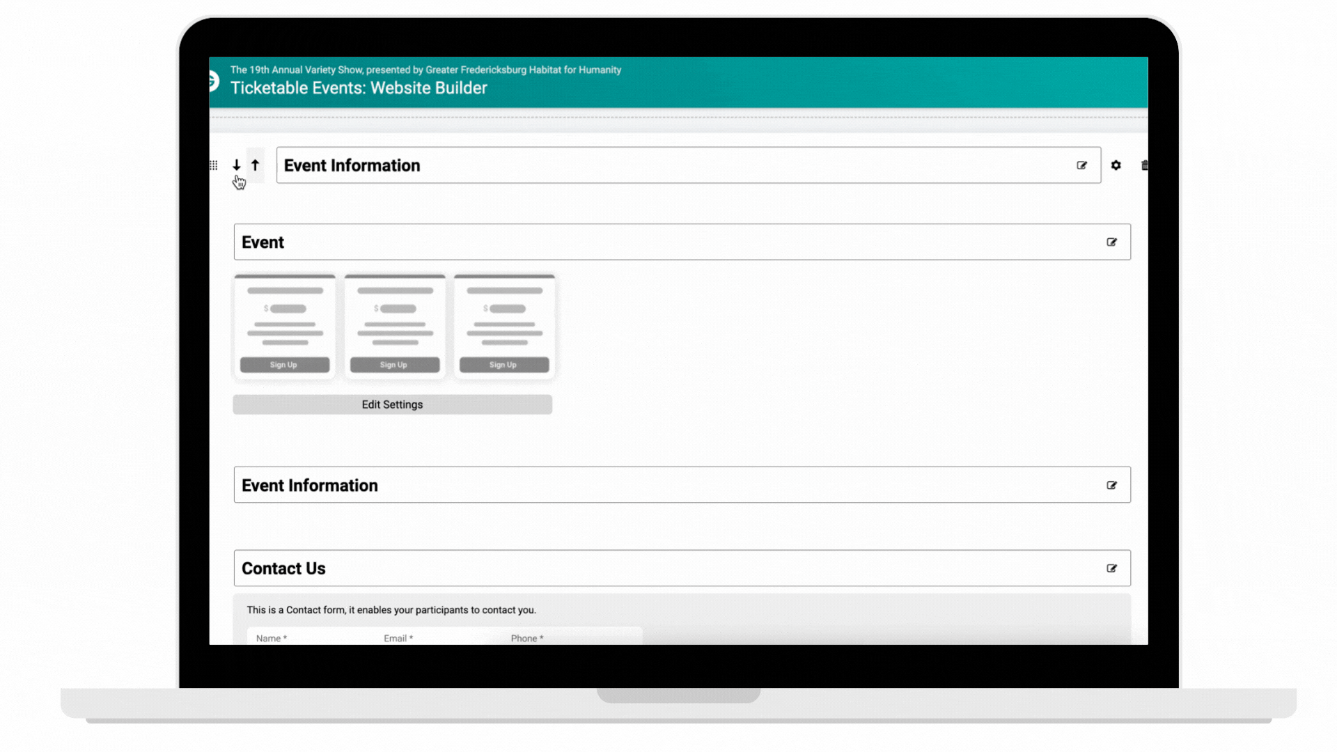
In addition to being able to rearrange the sections, you will have the same options to rearrange the order that content appears within a section:
Was this article helpful?
That’s Great!
Thank you for your feedback
Sorry! We couldn't be helpful
Thank you for your feedback
Feedback sent
We appreciate your effort and will try to fix the article